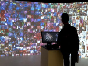
With the Cambridge Analytica scandal one might not be in the mood for seeing an exhibition about visualizing data while visiting Paris, but the “123 data” exhibition at the Fondation EDF is a “smiley face” showing what creators are doing with data. The exhibition is both fun and informative while making the argument that data is not just a threat to our private lives and means to enrich powerful corporations, but also a source of inspiration for artists.
The exhibition curated by David Bihanic, author of the book “New Challenges for Data Design,” shows the work of approximately forty cutting edge data visualizers such as David Bowen, Moritz Stefaner, the Domestic Data Streamers collective and the Periscopic Agency. It includes classics such as Bowen’s 2011 kinetic sculpture “Tele-Present Water” linking an undulating sculpture retrieving data in real time with a buoy in the South Pacific and ultra contemporary work such as “Network Effect” by Harris and Hocmuth exploring the psychological effect of using the internet. To make the interactive piece they gathered tweets that mentioned 100 behaviors such as hug, cry, blow and meditate and paired them with corresponding YouTube videos… Welcome to Alice’s rabbit hole.
“One Angry Bird” by Periscopic Agency explores the emotional arcs of the past ten U.S. presidential inaugural addresses. Explaining the work Periscopic says: “We examined the facial expressions of the last six presidents during the past 10 inaugural addresses, and revealed remarkable differences in the moods and emotions they conveyed. Five of the past six presidents were either positive or measured during their speeches, a striking contrast to the negative countenance found in President Trump’s inaugural remarks. We used the Microsoft Emotion API to detect facial expressions of the presidents while speaking.”
With five pieces in the exhibition Moritz Stefaner is one of the stars of the show. Stefaner says he lives and breathes data visualization… “I help organizations, researchers and businesses to find truth and beauty in relevant and meaningful data.” His “Multiplicy” is a collective portrait of Paris with photos posted on Instagram while his “Data Cuisine” pushes visualizing limits exploring food as a means of expressing data with edible diagrams. Tres fun.
The second floor is more contemplative. For example, Share Lab’s sobering work “The Human Fabric of the Facebook Pyramid” depicts FB’s digital space mapping the flow of personal information to targeted advertising. Putting it all in perspective the exhibition provides a wall of topical books and magazines which visitors can freely consult. Most are in English. And another nice touch is the multilingual roving guides available to answer visitors’ questions. Big “Like Button” click for “123 data”
“123 data,” to October 6. 2018. Fondation EDF, 6, rue Récamier, 75007 Paris. Free admission.

